
Optimizing Your Creator Profile for More Subscribers
What makes a fan stop scrolling and subscribe: practical profile and bio tips for InnerText creators.
Before a fan ever gets a message from you, they've already made a decision. They landed on your profile page, looked at it for a few seconds, and either tapped subscribe or closed the tab. That page is doing sales work whether you've thought about it that way or not, so it's worth treating it like one of the highest-leverage things you control.
This guide walks through the profile page fans actually see when they visit app.inner-text.com/yourusername (the photo, the bio, the pricing, and the button) and what to do with each one.
1. Your profile is a landing page, not a diary entry
It's tempting to write your bio the way you'd write an "About Me" on a social app: casual, a little scattered, updated whenever the mood strikes. Your InnerText profile isn't that. It's the first and only thing a cold visitor sees before deciding whether to hand over a phone number or a card. Every element on it should answer one of three questions in the first few seconds:
- Who is this person?
- What do I get if I subscribe?
- What does it cost, and how do I start?
If a visitor has to scroll or guess to answer any of those, you're losing people who were already interested enough to click through.
2. The photo and cover image fans actually stop for
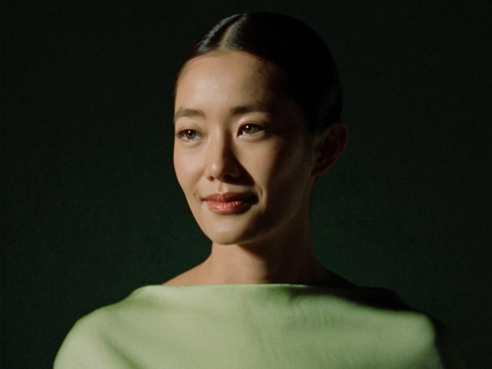
Your profile photo is the first thing rendered on the page, and it's doing the job a storefront window does: it either stops the scroll or it doesn't.
A few things that consistently work better:
- Direct eye contact, well-lit, close crop. A photo where you're looking at the camera reads as more personal than a posed, distant shot. Phones are small screens; faces need to be readable at thumbnail size.
- Consistency with your social presence. If a fan followed a link from Instagram or TikTok, the profile photo should look like the same person they just saw, not a completely different aesthetic. Mismatched photos create a split-second "did I click the wrong link" hesitation.
- A cover image that adds context, not clutter. The cover/showcase area is where you can hint at content style and personality without needing caption text to explain it. Keep it to one clear visual idea. A busy collage competes with your bio for attention instead of supporting it.
Swap your primary photo out every few weeks if you're posting regularly elsewhere. A profile that looks noticeably out of date signals an inactive account, and inactive accounts don't get subscribed to.
3. What to lead with
You have a few seconds and a few lines. Lead with the thing that makes you different, not with a greeting. "Hey, welcome to my page!" spends your best real estate saying nothing. Compare:
| Weak opener | Stronger opener |
|---|---|
| "Hi everyone, thanks for stopping by my profile!" | "Daily behind-the-scenes texts, real replies, no scripts." |
| "Welcome to my page :)" | "Former [credential/background] now sharing it all here first." |
| "New content every week!" | "New photo drop every Friday, plus texts back within the hour." |
The stronger version tells the fan what they're actually signing up for: a format (texts, drops, replies), a frequency, and something specific enough to feel real. Vague friendliness doesn't convert. Specificity does.
4. Writing a bio that converts
Keep the bio itself short. Three to five lines, structured in this order:
- One line on who you are: a credential, a niche, or a personality trait that's actually distinctive to you.
- One line on what a subscriber gets: content type, frequency, and whether you personally reply to texts.
- One line that sets tone: playful, direct, whatever matches how you actually talk. This is what makes the bio sound like a person instead of a template.
Worked example:
Certified yoga instructor turned full-time creator. Daily texts, weekly photo drops, and I read every reply myself. Come say hi, I don't bite (much).
That's four short sentences, and a stranger who's never seen you before now knows your background, your posting cadence, that you personally respond, and your tone. That's everything a bio needs to do.
Avoid two common mistakes: writing a bio that's all backstory and no offer (a fan can't tell what they'd be paying for), and writing a bio that's all price and no personality (nothing to connect with). The bio needs both.
5. Showing pricing without scaring people off
Your subscription tiers show up directly under your bio on the profile page, so pricing isn't hidden or something a fan has to ask about. It's right there next to the reason they'd want it. That's an advantage if you use it well.
A few practical rules:
- Lead with what's included, not just the number. "$9.99/mo: daily texts + weekly drops" converts better than "$9.99/mo" on its own, because the fan sees value and price in the same glance instead of having to infer value from elsewhere on the page.
- If you offer a free tier, make its limits clear. A free tier is there to get someone into your inbox and opted in. It shouldn't look identical to the paid tier, or there's no reason to upgrade.
- Round, simple pricing reads as more confident. Odd, over-engineered pricing tends to read as uncertain. Pick a number and stand behind it in the copy around it.
If you offer calls or premium unlocks beyond the base subscription, don't cram that pitch into the bio. The profile's job is to convert the first subscription. Everything past that point is a conversation you have over text, once they're already in your inbox.
6. The call-to-action fans actually tap
Every profile page ends the same way for a new visitor: a subscribe button. Make sure nothing about the bio or pricing area leaves the fan unsure what tapping it does. If a fan lands on your page from an inbound text, they've already opted in once, so the profile just needs to close the loop, not re-sell the whole idea from scratch.
For fans arriving cold, the button should feel like the obvious next step after reading three lines of bio, not a leap. That's the whole point of ordering the page the way it's laid out: photo earns the pause, bio earns the interest, pricing earns the confidence, and the button just needs to be there to catch it.
7. Ready to optimize your profile?
Pull up your own profile page right now and read it the way a stranger would, in the ten seconds you'd actually give a page you didn't already care about. Photo first, then bio, then price, then button. If any one of those makes you pause or guess, that's the line to rewrite first.
Ready to get started?
Start monetizing